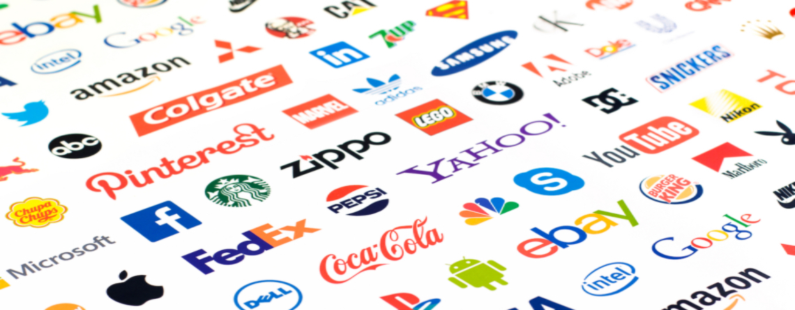
The creation of a great logo doesn’t just mean developing a lovely looking design. There are many factors which need to be taken into consideration to ensure the logo not only looks great but also works successfully for the organisation.
Below are nine key elements which contribute to a great logo design.
1. Storytelling
A logo should tell the story of the organisation and communicate its personality. The essential task for the logo designer is to understand the organisation they are designing for and its purpose.
Many of the best logos have hidden depths and clever graphical elements such as the arrow hidden in the FedEx logo or A-Z in Amazon. These nuances didn’t happen by accident; they were carefully planned by a design team thinking about the business and its story.
Creating a logo that looks great isn’t enough, it must communicate the personality of the organisation, supporting it’s goals to becoming more successful.
We should not only be designing the logo for our clients but also designing for the clients’ customers and stakeholders, as they are the ones we want to communicate with.
2. Scalability
The logo needs to be scalable so that it can be manipulated to work across different mediums, from the web to a massive billboard. To ensure this is the case the logo should be in a vector format. This means that the logo isn’t seen in simple pixels (this is how Photoshop views artwork), but instead, it is constructed in mathematical terms via border radiuses of the paths in the artwork (which is how Illustrator views artwork). This means that a logo can be scaled to infinite sizes without degrading in quality.
Now the logo can be scaled as large or small as needed, you also need to consider how it will work at both very large and very small sizes. Does it still tell the story and represent the organisation in the way you anticipated.
3. Impact
There are many ways that you can make the brand have greater impact, but a key way to do this is via the colour palette. Colours can be very emotive and engage at a high level with the target audience. Using colour can also help the brand stand out from the crowd and get noticed. You must remember that a great logo is highly versatile, so a grayscale version of the logo needs consideration, as it will not always be viewed in full colour.
4. Simplicity
As the famous saying goes KISS (Keep It Simple Stupid). Simple logos can make a big impact on a customer quickly, as they need less time to decipher it. Simple iconography can really help a logo stand the test of time, as seen with global brands such as Apple and Nike.
5. Legibility
It can be easy to get carried away with calligraphy style typography or clever wordmark logos, but it is essential that the brand can be clearly seen through the design. It’s good to be creative with the logo design process, but finding the right balance between legibility and creativity leads to a great, easily understood logo.
6. Flexibility
Years ago it was enough to have a logo that looks great in print. Today, there are a plethora of platforms in which the logo will be viewed, including online and offline. The growth of social media and the web has created the need for a effective logos/icons which can be viewed as an avatar, which is a small square representation of the logo, or in website headers. The avatar could be viewed at a small size so needs to be identifiable at dimensions of as small as 10mm².
The logo must be flexible enough to work on different backgrounds, on-line, in print, as an avatar, in greyscale and in different sizes.
7. Identifiability
The logo needs to be recognisable as the organisation, so it needs to be unique and stand out. This isn’t solely communicated through the logo. Much of the identifiability of a logo is channeled through marketing and wider branding, but the logo is where it all starts. Creating a generic or bland logo at the heart of a brand will make it harder to to gain recognition and connection.
Logos are often constructed from two elements, the wordmark and the symbol. Before an organisation can be solely recognisable with their symbol, it is likely that significant marketing / advertising effort will be required, so it is imperative they work together, as well as apart.
8. Timelessness
Creating a logo using today’s “design fads” will lead to a dated logo very quickly. A logo needs to stand the test-of-time to be able to still resonate with the target audience over years and as the organisation develops. Many logos may evolve over time, but you want to try and ensure only small iterations are needed to keep the brand fresh without wholesale rebranding.
9. Uniqueness
Ensure you have done your research and understand the both the competition and the market. It is important that the logo is unique and doesn’t just blend into all of the other logos in that sector. Custom hand drawn typography can help with this as it is unique. A well known example of a custom hand-drawn typographic logo is the iconic Coca-Cola script.
This doesn’t mean you have to be different for the sake of being different. If you need to use a design element, as it is essential to that organisation and telling their story, that’s OK, but it’s essential to ensure that the implementation clearly differentiates it from the crowd.
Essentially the job of the logo designer is to create a graphical mark for a business which helps that organisation achieve its goals. Careful consideration of the nine elements detailed above will support the design of logos which will achieve distinction and longevity.
